Behind every powerful piece is a foundation of core ideas that shape how we see and create. Whether you're sketching, painting, sculpting, or experimenting with design, understanding the Elements of Art and Principles of Design will help you grow with intention and confidence.
This blog breaks down these essentials in a clear, simple way, something you can turn to whenever you need a boost or a reminder of where it all begins.
The Elements of Art: What You Use to Make Art
Think of the Elements of Art as the raw ingredients of your work. These are the basic visual components artists use to build a piece.
1. Line
Lines are the foundation of most artworks. A line is simply a mark connecting two points, but it can do so much more:
- Types of Lines: Straight, curved, zigzag, dashed, spiral, thick, or thin.
- Purpose: Lines define shapes, create textures, and guide the viewer's eye around the composition.
A jagged line might convey tension, while a flowing, curved line could suggest a state of peace, mindfulness or elegance.
2. Shape
A shape is a flat, enclosed area created when lines meet. Shapes are two-dimensional (2D), meaning they have height and width but no depth.
Types:
- Geometric: Circles, squares, triangles (precise and mathematical)
- Organic: Irregular, free-form shapes found in nature like leaves, clouds, or puddles.
Shapes form the foundation of design and help organize the visual space.
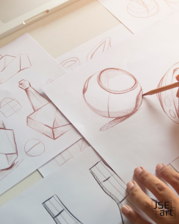
3. Form
Forms are three-dimensional (3D) versions of shapes. They have height, width, and depth, giving artwork a sense of volume.
Examples: Cubes, spheres, cylinders, cones.
Use in Art: Through shading and perspective, artists can make a flat image appear as if it pops off the page.
4. Color
Color is one of the most expressive elements in art. It can evoke emotion, set a mood, and bring energy to your work.
Components of Color:
- Hue: The name of the color (red, blue, green).
- Value: How light or dark a color is.
- Intensity: The brightness or dullness of a color.
Color Temperature:
- Warm colors (reds, oranges, yellows): Create excitement, warmth, or urgency.
- Cool colors (blues, greens, purples): Often calming, soothing, or distant.
5. Value
Value refers to the lightness or darkness of a color or tone. It plays a crucial role in creating:
- Contrast: Making certain parts of the artwork stand out.
- Depth: Suggesting dimension and form.
- Mood: High contrast can create drama; low contrast may feel subtle or soft.
6. Texture
Texture is how something feels or how it looks like it might feel.
- Actual Texture: Can be touched—like the bumpy surface of a collage.
- Implied Texture: Created through techniques to look real—like drawn fur, brick, or silk.
Texture adds interest and realism to your work.
7. Space
Space refers to the area within, around, and between objects in a piece.
- Positive Space: The subject or object itself.
- Negative Space: The background or empty areas around it.
- Depth Techniques: Overlapping, perspective, size variation, and shading all help create a sense of space.
Managing space well leads to stronger, more dynamic compositions.
The Principles of Design: How You Use the Elements
While the Elements of Art are what you use, the Principles of Design are how you use them. They guide how elements are arranged to create balance, harmony, and visual interest.
1. Balance
Balance is about distributing visual weight to make the artwork feel stable.
- Symmetrical: Equal on both sides—formal and structured.
- Asymmetrical: Uneven but still balanced—more dynamic.
- Radial: Elements radiate from a central point—like a flower or mandala.
2. Unity
Unity means all parts of the artwork feel like they belong together. It's the sense of cohesion and completeness.
- Achieved through: consistent color palettes, repeated patterns, or shared textures.
- Result: A harmonious, pleasing composition.
3. Variety
Variety keeps your artwork interesting by combining different elements.
- Too much repetition can feel dull.
- A mix of shapes, colors, or lines creates contrast and movement.
Think of variety as the spice that prevents visual boredom.
4. Emphasis
Emphasis is what draws the viewer's eye to a focal point.
- Created through: contrast, size, isolation, color, or placement.
- Use emphasis to highlight the most important part of your message or scene.
5. Movement
Movement guides the viewer's eye through the artwork.
- Actual movement (in kinetic art or animation) or
- Implied movement (through lines, shapes, and composition).
It's like visual choreography that leads the eye around your piece.
6. Pattern
Pattern involves repeating elements—like lines, shapes, or colors.
- Patterns create rhythm and unity.
- Can be decorative or structural.
Patterns are everywhere in art and design—from textiles to architecture.
7. Proportion
Proportion is about the size relationships between objects in your artwork.
- Realistic or exaggerated—either can be effective.
- Changing proportions can create drama, focus, or humor (like in caricatures or surrealist art).
Why These Foundations Matter
Mastering these fundamentals helps you:
- Build stronger compositions
- Understand what makes art "work"
- Experiment with confidence
- Communicate ideas visually
- Develop a personal style
Whether you're drawing your first portrait or designing a brand logo, these tools will always apply.
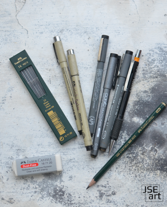
Curious What Materials We Use?
We create our work using museum-grade paper and archival-quality mediums. If you're curious about our exact supplies, or need help choosing your own, we've written a guide to our favorite paper types and alternatives here.
What Do You Use in Your Creative Process?
We'd love to hear from you. Do you have a favorite principle you always go back to? Are there elements you struggle with, or use differently?
Tell us what you're working on, what you're learning, and what inspires you. You might help the next artist grow, too.